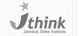
As a representative design element that symbolizes the Jeonbuk State Institute, the word mark plays the most important role in establishing the identity of the Jeonbuk State Institute and forming an integrated image.
It is a form that expresses the role and value of Jeonbuk State Institute, which is leaping into a green future by using Jeonbuk State's green growth as a stepping stone, as J, the initials of Jeonbuk State.
In addition, the initial J is also expressed in the shape of infinity, expressing the status of the institute that provides infinite synergy to the development of Jeonbuk State, while the orange colored sphere symbolizes the red rising sun all over Jeonbuk State, and it contains the message that the Jeonbuk State Institute's efforts are responsible for the hopeful tomorrow of Jeonbuk State in a macroscopic manner.
PANTONE 286C C100+M70
Blue _ Expresses the blueprint for the future of the Jeonbuk State region
PANTONE 368C C60+Y100
Green _ Means development through eco-friendly green growth
PANTONE 144C M50+Y100
Orange _ Expresses the dynamic and passionate institute like the rising sun
As a design element that composes the identity together with the word mark, it is used to indicate the official name of the institute.
CI signature
The signature is a design element that combines the word mark and the logo type in an optimal proportion. An appropriate signature should be used depending on the medium, but the combination method should follow the established principle.
QRcode
It is a two-dimensional (matrix) type code that contains a variety of information in a rectangular horizontal and vertical grid pattern. ‘QR’ stands for ‘Quick Response’. If you touch your smartphone to the QR code, you will be connected to the website of the product and can receive information from the Jeonbuk State Institute.